
How to Adapt Traditional British Textile Patterns for Modern Digital Products
A mill in Selkirk still keeps its pattern books the way a library keeps first editions. Open one and you find tartans built thread by thread, damask drafts the size of a dinner plate, and stripe charts annotated in pencil. These motifs have lasted because their structure is sound, not because they happened to be in fashion.
Screens ask something different of them. A pattern on cloth is read at a distance, in motion, in changing light. A pattern on a phone is read at forty pixels wide, between two taps, often on a dark background. The work is not to flatten heritage into decoration but to translate it, keeping the rhythm that made it recognisable in the first place.
Learn the Repeat Before You Redraw It
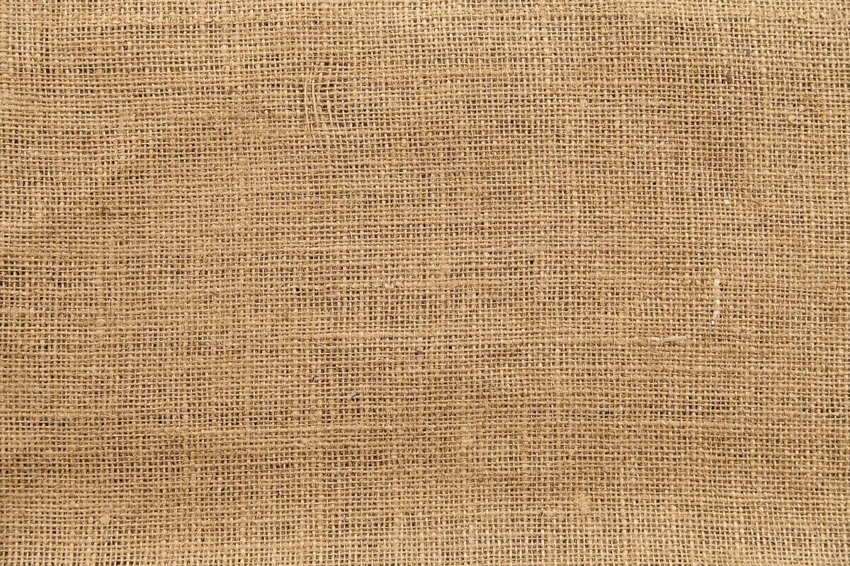
Every traditional pattern is a system with rules, and those rules are what your eye recognises. A tartan is a sett: a fixed sequence of coloured threads, mirrored in both warp and weft. Where the two cross, the colours blend into new intermediate shades, and the twill weave draws a soft diagonal through the whole thing. Redraw a tartan as a grid of flat squares and you will lose the diagonal and the half-tones — the two things that make it read as cloth rather than as a picnic blanket.
Damask works the opposite way. The motif is tone-on-tone, woven in contrasting weaves so the pattern appears through surface sheen rather than colour contrast. On screen there is no sheen, so the silhouette has to carry the whole idea. Stripes are the simplest of the three and the easiest to get wrong: a ticking stripe, a regatta stripe and a bengal stripe all look like lines, but their character lives in the spacing ratio between thick and thin bands.
Before designing anything, build the repeat as a single tile and test that it joins seamlessly at 100% zoom. If the tile does not close, nothing downstream will save it.
Cut Detail, Keep the Rhythm
Print tolerates fine line work; small screens do not. Thread texture, subtle tonal shifts and intricate damask foliage will collapse into grey mush once a pattern drops below about 32 pixels. The fix is not to simplify the idea but to simplify the rendering.
- Reduce to three or four colours. Keep the proportions of the original, not the palette count.
- Preserve the diagonal. In tartan this is non-negotiable; the offset is more recognisable than the exact colours.
- Drop the texture, not the structure. Noise and grain disappear first when compression and scaling get involved.
- Test at 16, 24 and 32 pixels before you fall in love with the large version.
- Make a quiet variant at 6 to 10 percent opacity for backgrounds that sit behind content.
A good rule: if the pattern still reads when you squint at it from arm's length, the hierarchy is right. If it turns into a flat wash, you have simplified past the point of meaning.
Colour Is Where It Usually Goes Wrong
Wool takes dye softly. Screens emit light. Sample a tartan straight from a photograph and you will import the lighting of the room it was taken in — a warm cast, a shadow, a slightly dull mid-tone that looks muddy against a white interface. Pull your colours as flat, deliberate choices instead, then build a light and a dark set from them.
Two practical constraints matter more than palette accuracy. First, contrast: any text sitting on a pattern needs a scrim, a solid panel, or a background that keeps the pattern under roughly ten percent opacity. Second, dark mode. A sett that reads beautifully on cream can turn into a vibrating mess on near-black. Push the mid-tones up, reduce the number of colours, or invert the relationship between ground and pattern.
It also helps to soften the extremes. Pure black and pure white were not available to a Victorian dyer, and they rarely flatter a heritage motif.
Let Scale Do the Work
One motif, three jobs. A hero version at full scale for headers and marketing panels. A surface version at around forty percent for cards, dividers and empty states. A texture version at ten to fifteen percent for large backgrounds where the pattern should be felt rather than seen.
Do not scale stroke weights linearly, though. Below a certain size, fine lines break up and shimmer, so convert them to solid blocks and widen the gaps. In CSS, a repeating SVG data URI with a defined background-size is usually the cleanest route, and it lets you swap colours with custom properties without touching the artwork.
Let It Move, Gently
Damask can breathe: a very slow scale or drift over thirty to forty seconds adds life without stealing attention. A stripe band can drift on scroll with modest parallax. Tartan is better left still — the diagonal already implies movement.
Whatever you animate, offset the layer by exactly one tile width so the loop is invisible, and respect the prefers-reduced-motion setting. Avoid rapid contrast flicker entirely; slow, low-contrast movement is both more elegant and safer.
Know What You Are Allowed to Use
Some names carry legal protection. Harris Tweed, for example, is a statutorily protected name tied to cloth woven in the Outer Hebrides. The Scottish Register of Tartans records who designed a sett and under what conditions, but inclusion in the register is not the same as a licence to reproduce it commercially. Clan and family associations also carry meaning that a brand can borrow only clumsily.
For any commercial use of a named or protected pattern, take proper legal advice before you build it into a product. It is a short conversation that saves a long one later.
A Workflow You Can Run This Week
- Find one authentic source — a woven sample, a museum image, a mill archive — and study the repeat.
- Redraw the tile by hand or on a grid, matching the ratio of the original band widths.
- Reduce to four colours and check the diagonal survives.
- Export as SVG, name the file by construction rather than by mood, and store colours as tokens.
- Drop it into a real layout at three scales and two themes, with actual text on top.
- Fix the contrast, then cut the pattern back by a third. It is almost always too loud the first time.
- Document the rules — minimum size, allowed opacity, animation limit — so the next person does not reinvent it badly.
Patterns like these have already survived a century of taste. Treat the repeat as the design and the screen as the loom, and the character takes care of itself.
Photo: lovepixs / Pixabay